Copycat Magazine Cover Project
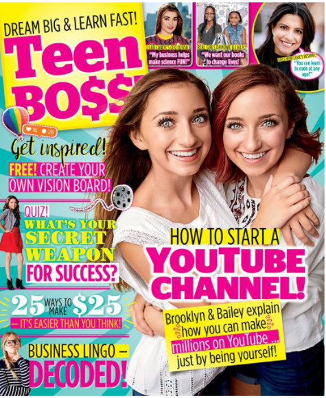
For the copycat magazine cover project, I recreated a Teen Bo$$ cover:


My overall impression of my project (including what I like and dislike most about my finished cover, my struggles, and what I rate it/why)
I enjoyed this project and was super proud of my finished variation. My original cover did not have an issue date or price, nor did it have a barcode, so that is the only thing I had to add to make it complete. I tried not to use the exact same small details as the original; for example, there were some little lines near the number and I used a brush for a stamp instead that looked a little more appropriate for my theme. I also used cute heart divider lines instead of the boring double divider lines on the original. But, they all take up relatively the same amount of space and look pretty good.
I did not struggle too much with the cover. Font matching was time consuming, but not difficult. There were many shapes to make and I wasn't as organized as I should have been, so I wasted a bit of time trying to figure out which shape was which (and eventually named them and grouped them). But my biggest struggle was my main photograph. I took several. Since the original had two people, it was hard to take up similar space and I knew I had to have part of my head go in front of the title box. So, my best idea was to hold my Chrome book so the other side of the image had some balance to it. But, sadly, I took the photo in my living room and not on a solid background so the picture was hard to select. My hair was a nightmare to select and that is the weakest part of my image.
The rest was pretty simple to do and I am overall pleased with the finished cover. I'd give it a 9.5 out of 10, mainly because I could have done better on the selection of my hair, but I was too frustrated to start over and try to improve that one element.
The two layer styles used (fx) included--> (also tell where they are used)
I used layer styles in numerous places. The big yellow box in the top left has a radial gradient overlay with a stroke. The small photo boxes at the top have both strokes and drop shadows. Husband at the bottom has an drop shadow, which I had to make really "hard" because it wasn't "glowy" like most of those shadows are. Business Teacher has a big white outer glow.
The special features or others used included--> (also tell where they are used)
I used a large custom sunburst shape on the background to create those lines for my first special feature. For my second, I used a Hue/Saturation adjustment layer to make the colors of the icons and the volleyball be pink to match the theme. And, I modified the tracking on several of the text boxes to make the letters closer together to mimic the original cover. The cursive font needed significant adjustment (-40) and most of the thin skinny words are slightly adjusted (-10). The words at the bottom of the two picture boxes at the top are set to -50.
Comments
Post a Comment